PROJECT DESCRIPTION
This project focused on developing a cohesive visual identity system for the senior capstone showcase. The goal was to create a brand that reflected the graduating class while ensuring the identity supported rather than overwhelmed the student work on display. The system extended across print, social media, signage, and merchandise to create a consistent event experience.
ROLE & RESPONSIBILITIES
I served as a project lead, supporting team coordination and design direction within a tight timeline. I helped define roles, set project goals, and guide key design decisions alongside a team of designers. I independently developed print collateral and promotional materials, and contributed to merchandise design and environmental graphics elements.
CONCEPT / THEME
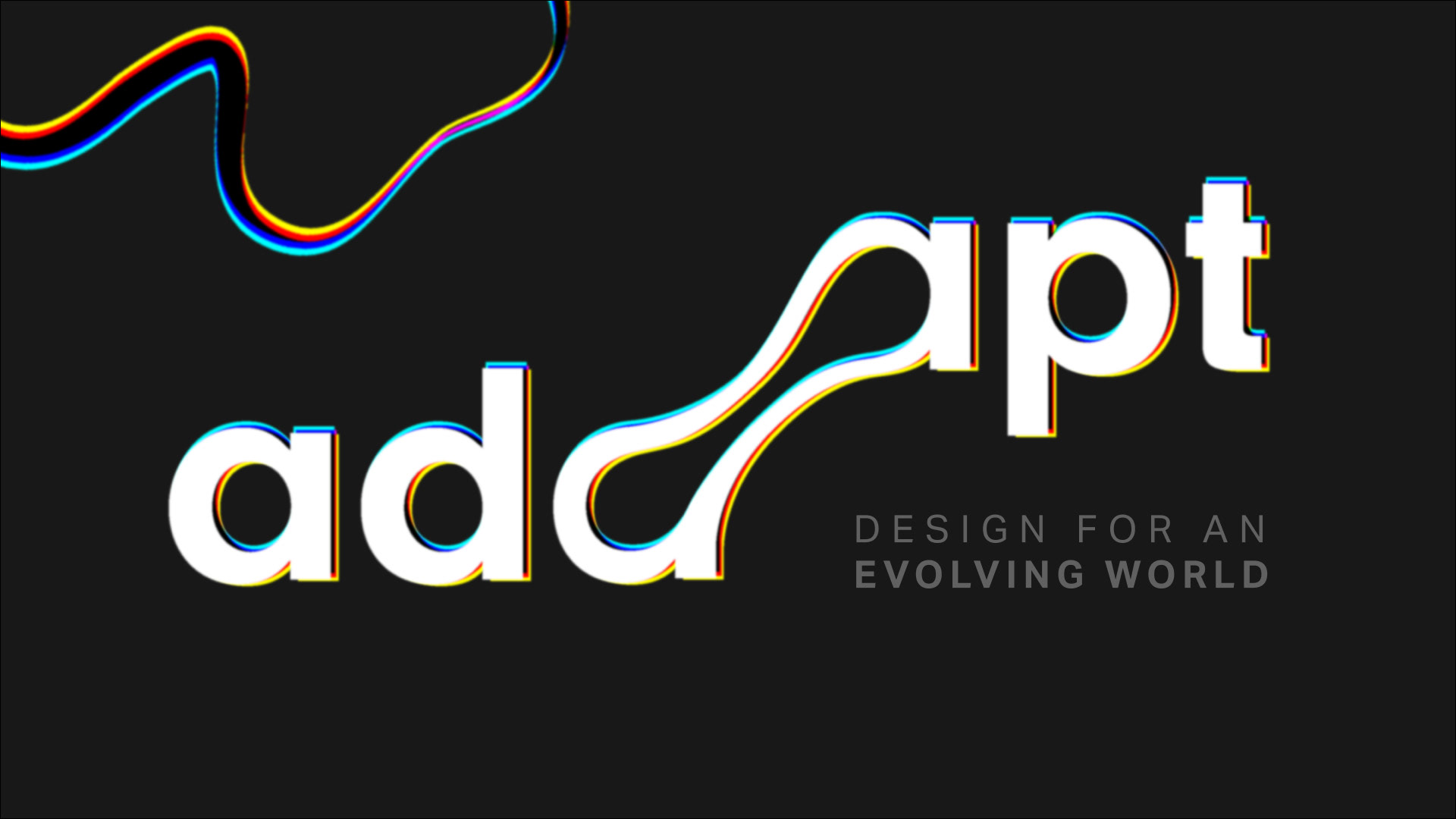
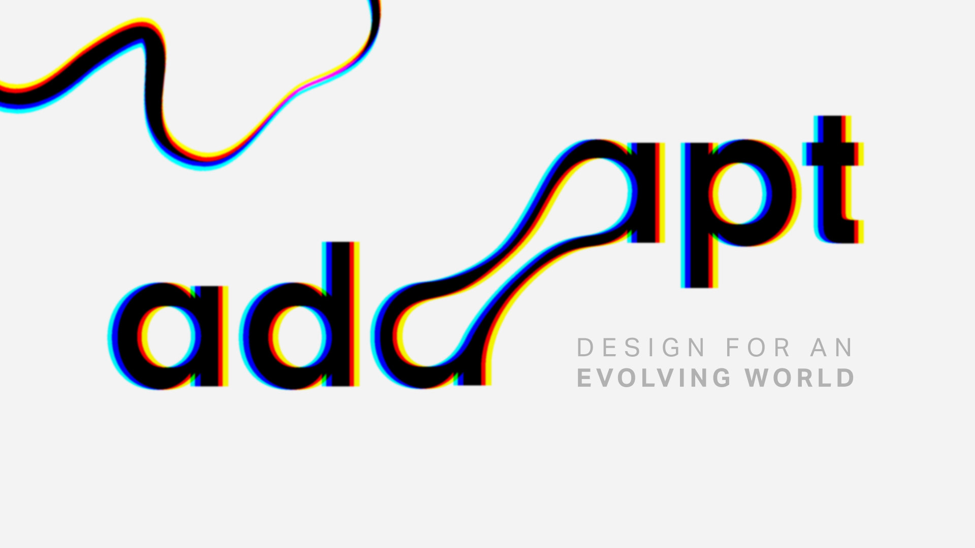
The exhibition, titled “ADAPT,” was structured around the idea of how the graduating class of 2024 evolved as designers in response to a changing world. The identity system was designed to reflect resilience, growth, and transformation while organizing the exhibition into thematic categories that framed the diversity of student work.
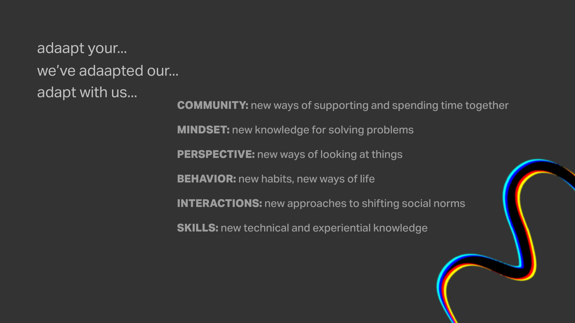
CATEGORIES WITHIN THE EXHIBITION
Following the selection of the “ADAPT” theme, the exhibition was organized into a series of categories that framed the different ways the senior class has evolved as designers. These groupings were designed to communicate growth, process, and individual approaches to adaptation within the discipline.
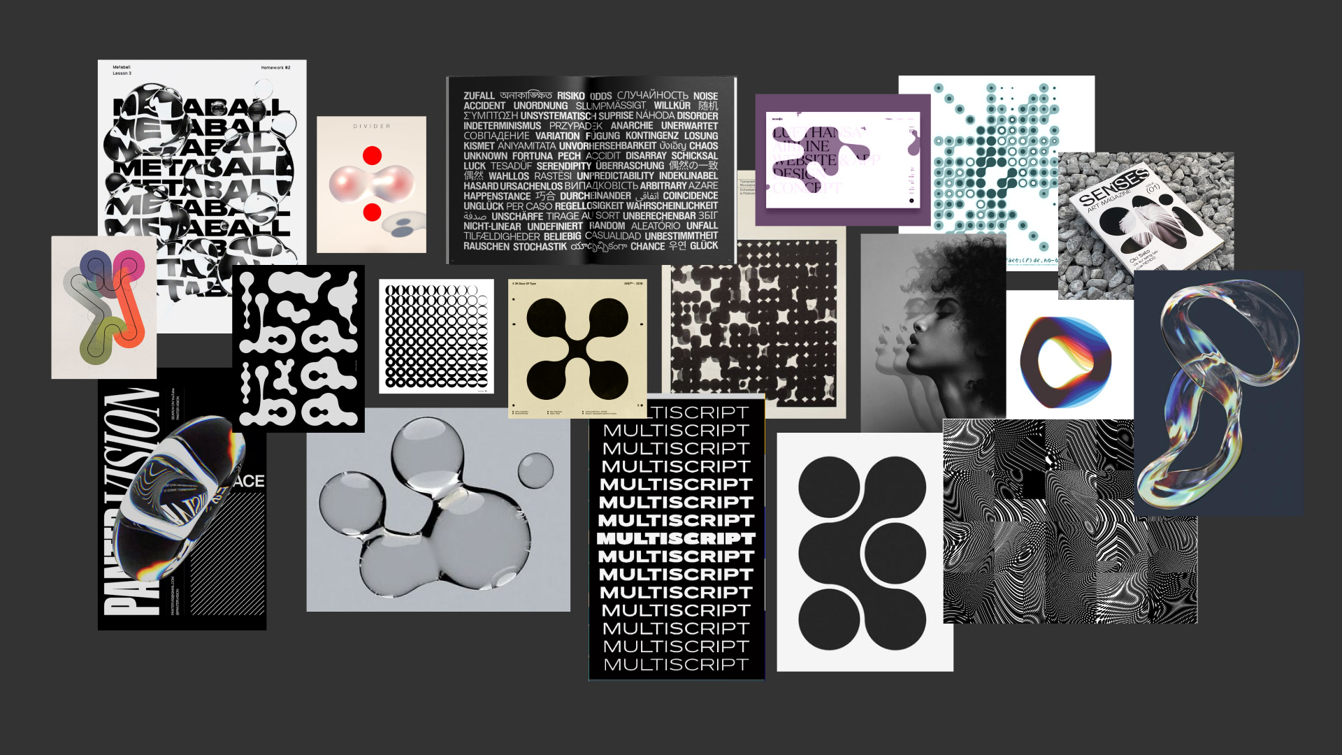
VISUAL INSPIRATION (MOODBOARD)
The visual direction was guided by themes of constant movement, transformation, and morphing. These ideas informed the development of a dynamic and evolving visual language that reflected the concept of adaptation throughout the exhibition identity.
PROMOTIONAL VIDEO
Led the promotional video team by defining goals, setting deadlines, and managing the production timeline. Contributed to music direction and facilitated team reviews to maintain progress and alignment.
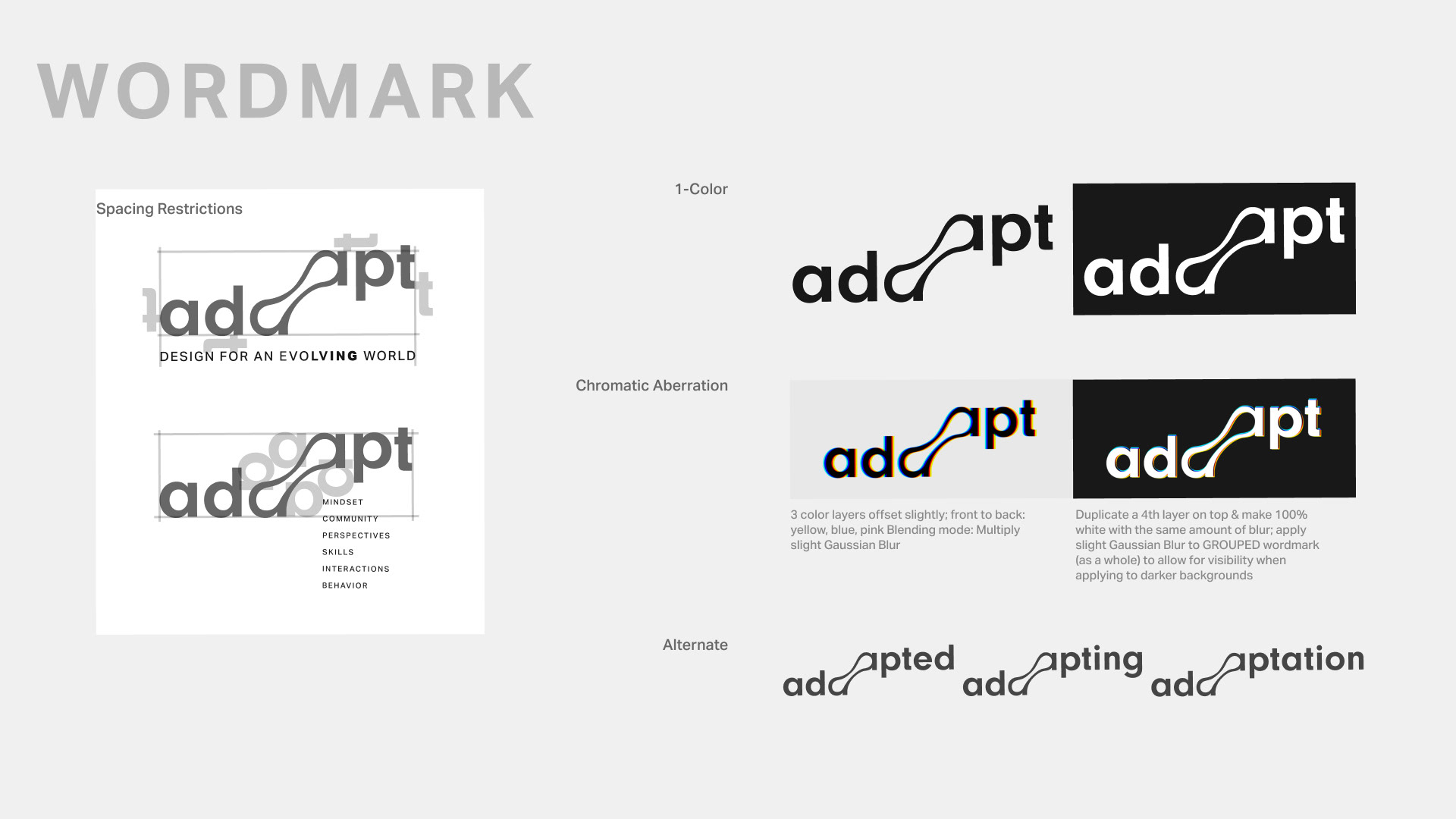
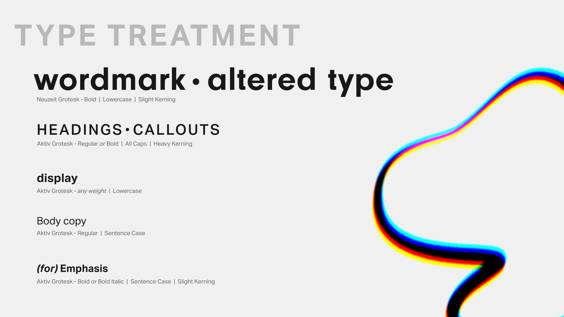
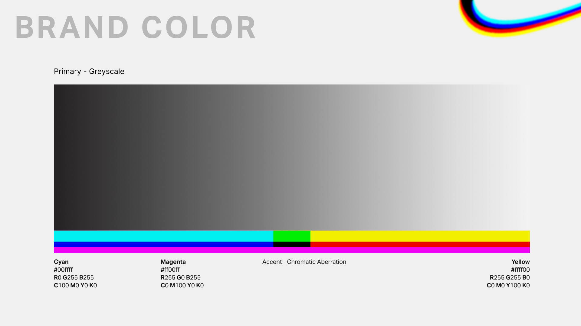
BRAND IDENTITY
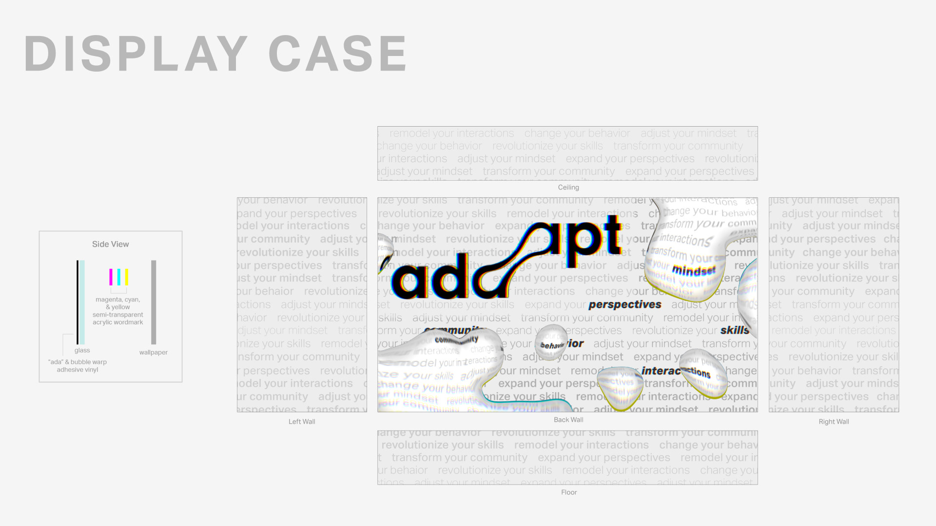
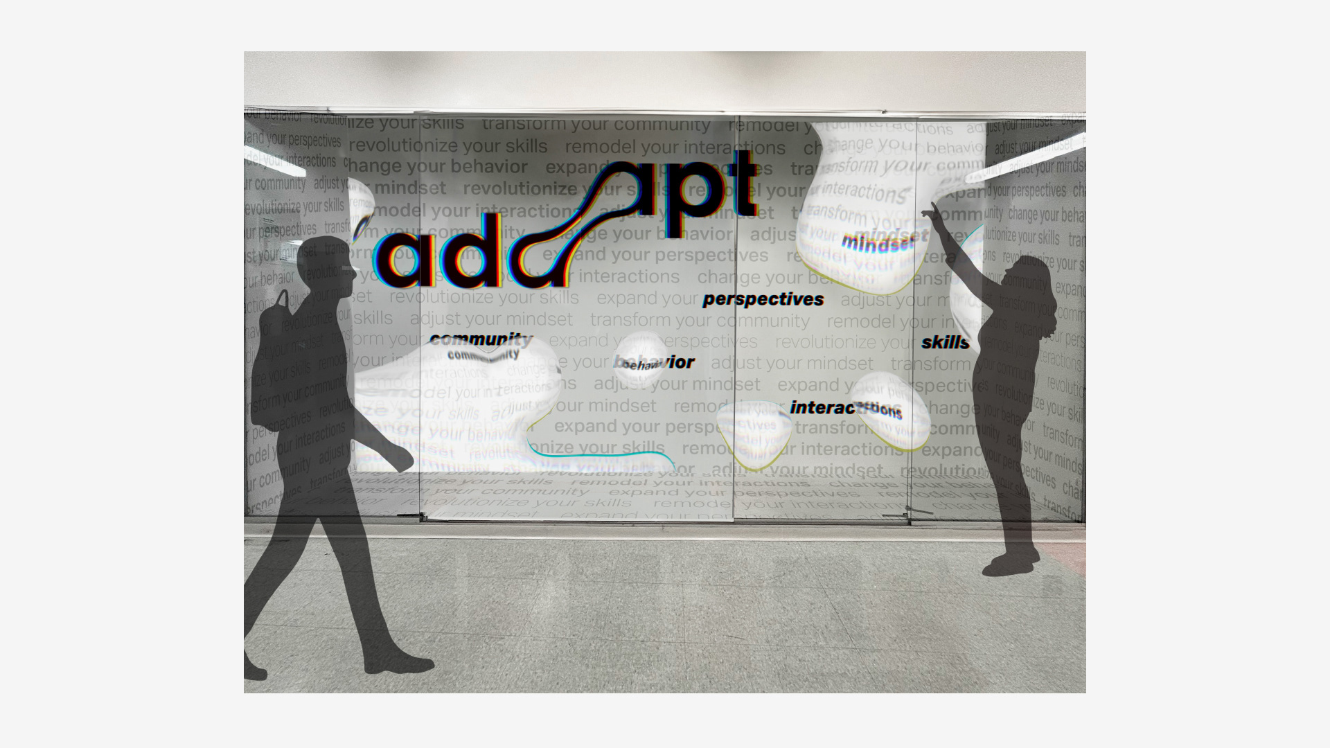
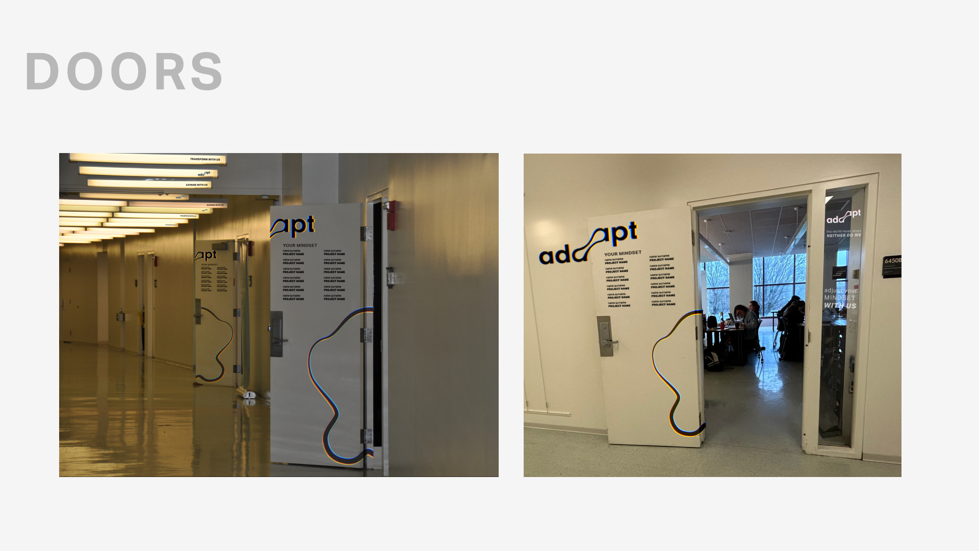
The wordmark integrates “DAAP” into the identity system through a typographic approach that balances playfulness and sophistication. The design explores proportion, spacing, and variation to create a mark that reflects both the character of the graduating class and the academic context of the exhibition.
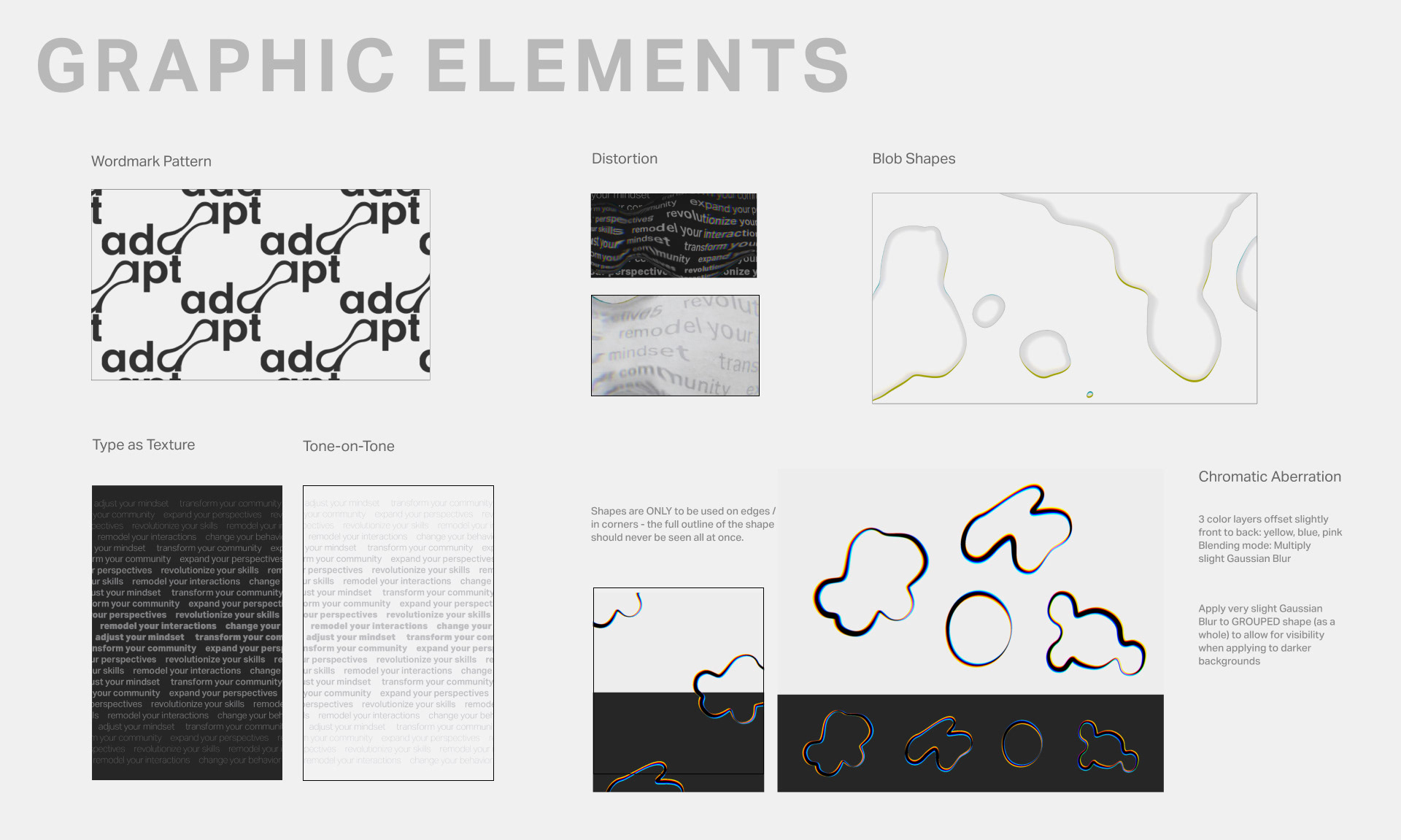
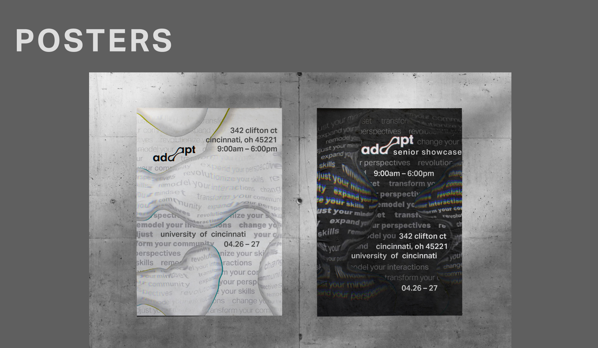
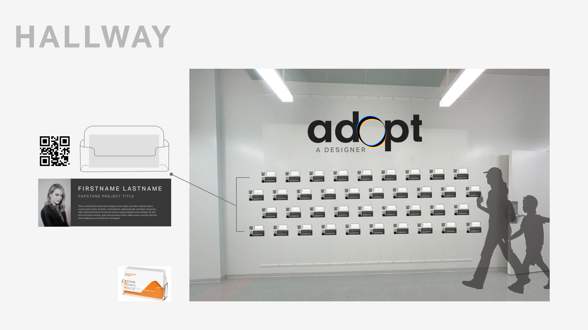
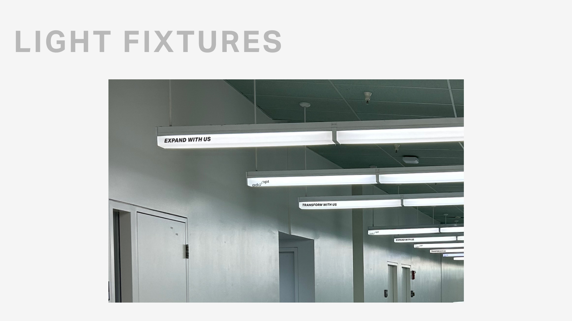
Environmental graphics were strategically placed to create a sense of constant movement, reinforcing the exhibition’s themes of transformation and adaptation.
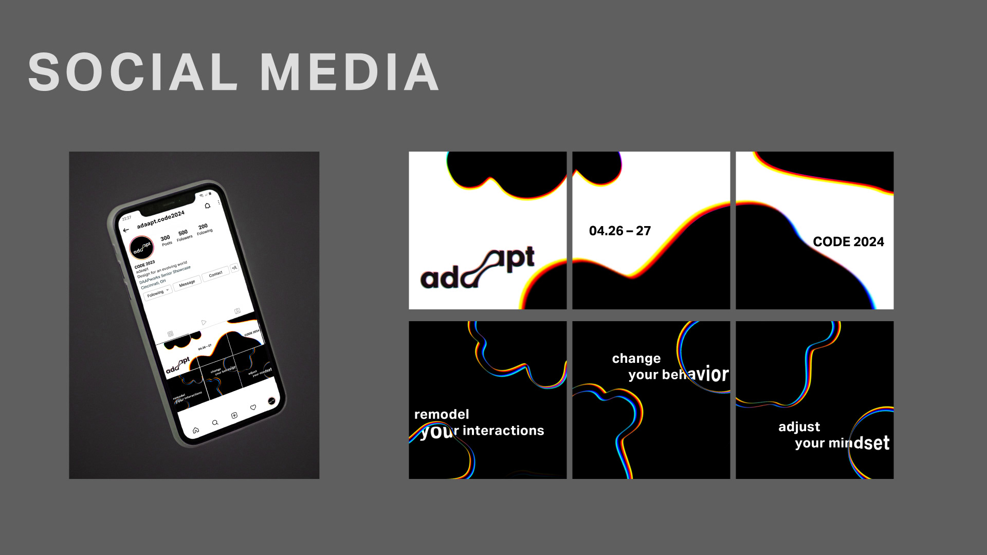
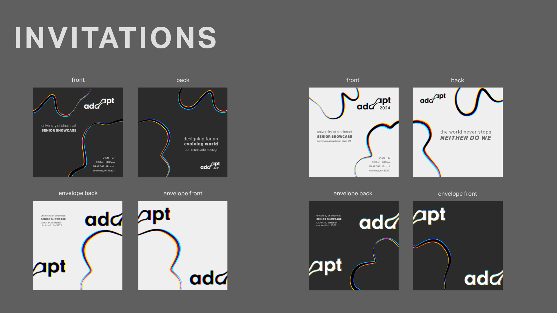
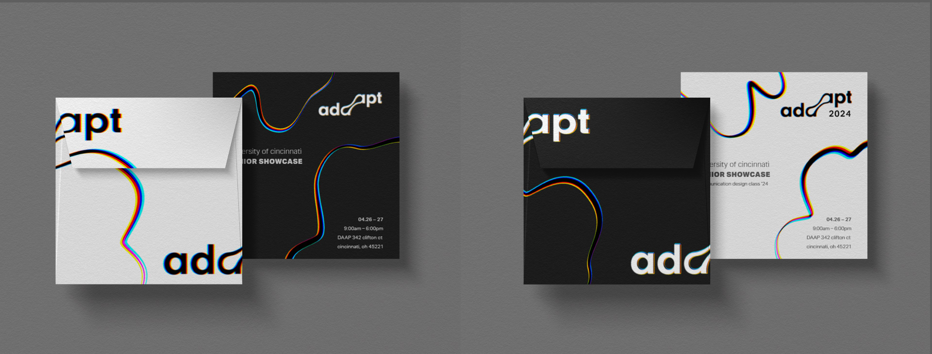
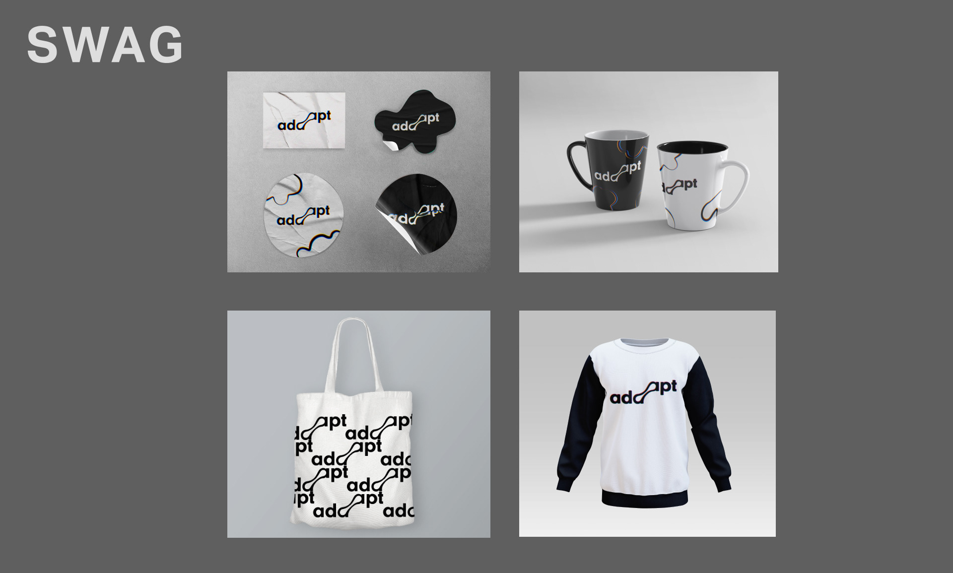
PROMOTIONAL MATERIALS
Developed a cohesive suite of promotional assets including a social media campaign, posters, invitations, and event merchandise (“swag”) to support and extend the exhibition identity across multiple touchpoints.